Layout
There are optional parameters that can be used to customise the Fluid Player. None of the options are required but can be tailored to better suit your own design. Layout controls relate to the functionality and styling of the player itself. The full list of layoutControls are below:
fluidPlayer(
   'my-video',
    {
        layoutControls: {
            primaryColor:           false,
            playButtonShowing:      true,
            playPauseAnimation:     true,
            fillToContainer:        false,
            autoPlay:               false,
            preload:                false,
            mute:                   false,
            doubleclickFullscreen:  true,
            subtitlesEnabled:       false,
            keyboardControl:        true,
            layout:                 'default',
            allowDownload:          false,
            playbackRateEnabled:    false,
            allowTheatre:           true,
            title:                  false,
            loop:                   false,
            roundedCorners:         0,
            logo: {
                imageUrl:           null,
                position:           'top left',
                clickUrl:           null,
                opacity:            1
            },
            controlBar: {
                autoHide:           true,
                autoHideTimeout:    3,
                animated:           true,
                playbackRates:      ['x2', 'x1.5', 'x1', 'x0.5']
            },
            timelinePreview:        {},
            htmlOnPauseBlock: {
                html:               null,
                height:             null,
                width:              null
            },
            playerInitCallback:     (function() {}),
            miniPlayer: {
                enabled: true,
                width: 400,
                height: 225
            },
            autoRotateFullScreen: false,
        }
    }
);
primaryColor
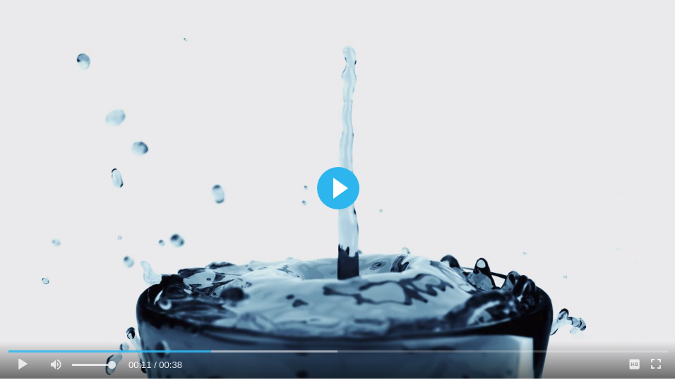
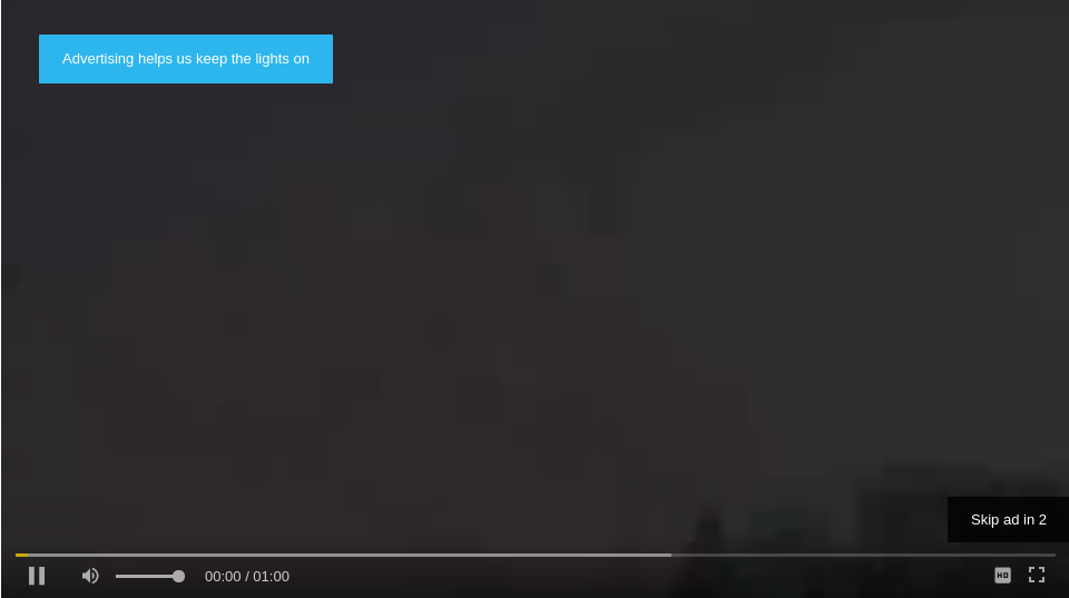
Primary color affects the following areas of the Fluid Player:
- Play button showing before video play (Default: grey)
- Play and pause animations and video toggle (Default: grey)
- Video played progress bar (Default: white)
- User defined ad text (Default: black)
Changing this parameter will change all the above areas to the color specified. In the below screenshot we have used the following:
fluidPlayer(
   'my-video',
    {
        layoutControls: {
            primaryColor: "#28B8ED"
        }
    }
);
posterImage
The poster attribute for videos allows an image to be shown before the video plays. This can be set as a Fluid Player parameter. By default it will be set to false, and show no image.
fluidPlayer(
   'my-video',
    {
        layoutControls: {
            posterImage: 'path/to/my/image.jpg' // Default false
        }
    }
);
posterImageSize
To change the size of the poster image you can use the posterImageSize property, with the values cover, contain our auto.
To read more about each value check the background-size MDN page.
fluidPlayer(
   'my-video',
    {
        layoutControls: {
            posterImageSize: 'cover' // Default `contain`
        }
    }
);
playButtonShowing
By default the play button will show in the middle of the player. To hide the button this option can be set to false. When this option is set to false the video controls will show by default.
fluidPlayer(
   'my-video',
    {
        layoutControls: {
            playButtonShowing: false // Default true
        }
    }
);
playPauseAnimation
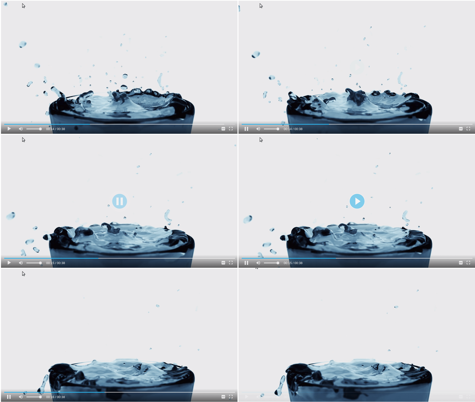
There is a Play / Pause animation that can be disabled using this parameter. By default this parameter is set to true
fluidPlayer(
    'my-video',
    {
        layoutControls: {
            playPauseAnimation: false // Default true
        }
    }
);
fillToContainer
If the Fluid Player is placed into a container on your page you can use this parameter to fill to the size of that container. Set this parameter to true to set the width and height to 100%.
{{< note title="Note">}} It is important to ensure that the container has a defined width and height, otherwise the player will not have a fixed size. {{< /note >}}
fluidPlayer(
    'my-video',
    {
        layoutControls: {
            fillToContainer: true // Default true
        }
    }
);
roundedCorners
This parameter defines the rounded corners for the video player. You can pass either a number or a string:
- Number: Automatically converts to pixels (
px). For example,10becomes10px. - String: Can include any valid CSS unit for
border-radius(e.g.,%,em,rem,px, etc.). If the string can be parsed as a number (e.g.,"10"), it defaults topx.
This allows full flexibility to use any value supported by the CSS border-radius property.
fluidPlayer(
    'my-video',
    {
        layoutControls: {
            roundedCorners: 0 // Default 0
        }
    }
);
autoPlay
By default this parameter is set to false. When set to true the video will play automatically when the page loads. Please note that this feature may not work on certain browser versions and depends on their AutoPlay Policies.
fluidPlayer(
    'my-video',
    {
        layoutControls: {
            autoPlay: true // Default false
        }
    }
);
preload
Sets the preload parameter on video tag. By default this parameter is set to 'auto'.
Note: To change the preload configuration for hls.js and dash.js, you need to change the configuration for each module.
fluidPlayer(
    'my-video',
    {
        layoutControls: {
            preload: 'auto' // Default 'auto'
        }
    }
);
mute
Set this parameter to true to have the video muted by default.
fluidPlayer(
    'my-video',
    {
        layoutControls: {
            mute: true // Default false
        }
    }
);
doubleclickFullscreen
Set this parameter to true to have double click to toggle fullscreen
fluidPlayer(
    'my-video',
    {
        layoutControls: {
            doubleclickFullscreen: true, // Default true
        }
    }
);
subtitlesEnabled
Set this parameter to true to have subtitles, provided track information given. You can read more about subtitles here.
fluidPlayer(
    'my-video',
    {
        layoutControls: {
            subtitlesEnabled: true, // Default false
        }
    }
);
keyboardControl
The following key commands are usable by Default:
- Space/Enter: Pause/Play video playback
- Left/Right arrow: Go back/forward 5 seconds
- Home/End: Go to beginning/end of video
- Numbers 0-9: Skip to a particular section of the video (e.g., 5 goes to the video midpoint)
- Up/Down arrow: Increase/Decrease volume 5%
- m key: Mute/Unmute video volume
- f key: Go to Full Screen mode
If you wish to disable these options set keyboardControl to false
fluidPlayer(
    'my-video',
    {
        layoutControls: {
            keyboardControl: false // Default true
        }
    }
);
title
Set this parameter to have the title displayed on your video. Disabled by default.
fluidPlayer(
    'my-video',
    {
        layoutControls: {
            title: 'My video title' // Default false
        }
    }
);
loop
Set this parameter to have the video loop. Disabled by default.
fluidPlayer(
    'my-video',
    {
        layoutControls: {
            loop: true // Default false
        }
    }
);
logo
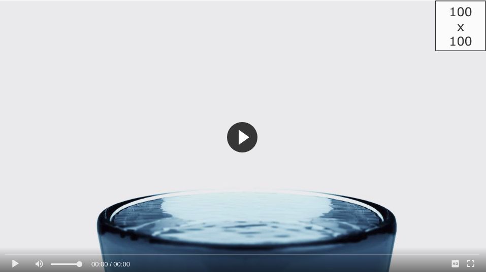
The logo option allows you to show an image overlaid in the corner of the player. There are 4 options that can be set to configure this logo.
- imageUrl: The location of the image to show. (Default: null)
- position: Where on the player the logo will show. The options are top left, top right, bottom left or bottom right. (Default: 'top left')
- clickUrl: If you want the logo to be a link to another page you can set the landing page with this parameter. (Default: null)
- opacity: This will toggle the opacity styling option of the logo. (Default: 1)
- mouseOverImageUrl: You can specify a separate image to show on mouseover of the logo. (Default: null)
- imageMargin: The margin on the logo can be specified using this parameter. (Default: '2px')
- hideWithControls: If you want the logo to only appear along with the video controls you can set this parameter to true. (Default: false)
- showOverAds: The logo will not show during in-stream ads by default, but you can specify the logo to show during ads using this parameter. (Default: false)
fluidPlayer(
    'my-video',
    {
        layoutControls: {
            logo: {
                imageUrl: 'https://www.routetomylogo.com/logo.jpg', // Default null
                position: 'top right', // Default 'top left'
                clickUrl: 'https://www.landingpage.com/welcome', // Default null
                opacity: 0.8, // Default 1
                mouseOverImageUrl: 'image/on/hover.jpg', // Default null
                imageMargin: '10px', // Default '2px'
                hideWithControls: true, // Default false
                showOverAds: 'true' // Default false
            }
        }
    }
);
controlBar
The control bar will hide when the mouse is inactive after a certain amount of time. There are three options for this parameter:
- autoHide: Configure whether or not to hide the controls. (Default: false)
- autoHideTimeout: How long, in seconds, before the controls will hide. (Default: 3)
- animated: If set to false the controls disappear instantly. True be default, will mean the controls fade out. (Default: true)
- playbackRates: Allow customization of the playback rates. If
playbackRateEnabledset totruethe available options can be set with this property. (Default:['x2', 'x1.5', 'x1', 'x0.5'])
fluidPlayer(
    'my-video',
    {
        layoutControls: {
            controlBar: {
                autoHide: true, // Default false
                autoHideTimeout: 5, // Default 3
                animated: false, // Default true
                playbackRates: ['x2', 'x1']
            }
        }
    }
);
timelinePreview
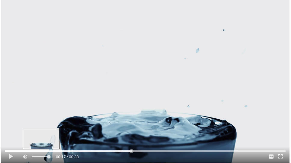
Thumbnail preview is discussed more here.
Sets the timeline preview, visible when hovering over the progress bar. The provided file contains the thumbnail images used for the preview. The type sets the format of the file. Currently only the VTT format is supported. The timeline preview only works if the default layout is chosen (see above).
fluidPlayer(
    'my-video',
    {
        layoutControls: {
            timelinePreview: {
                file: 'thumbnails.vtt',
                type: 'VTT'
            }
        }
    }
);
htmlOnPauseBlock
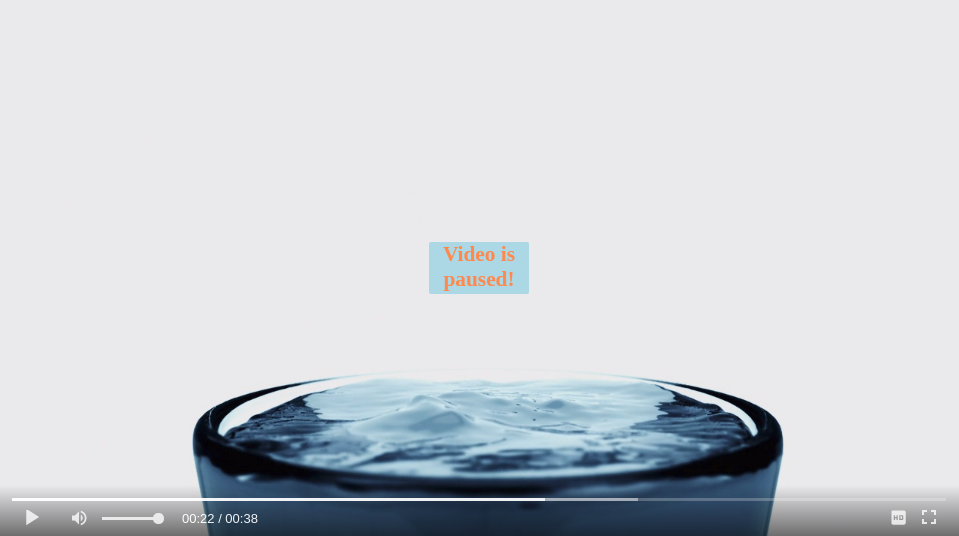
Defined HTML to be displayed in the center of the player when the user pauses the video. Note: Clicking on the HTML area triggers a play event. If you don't need that behaviour then add e.stopPropagation() to your event. There are three options for this parameter.
- html: The HTML to display.
- height: The height of the HTML to show. An integer representation of the pixel size.
- width: The width of the HTML to show. An integer representation of the pixel size.
fluidPlayer(
    'my-video',
    {
        layoutControls: {
            htmlOnPauseBlock: {
                html: '<b>Paused</b>', // Default null
                height: 50, // Default null
                width: 100 // Default null
            }
        }
    }
);
layout
The default layout is default. It provides own skin to the player. Optionally you can define your own custom layout with CSS.
fluidPlayer(
    'my-video',
    {
        layoutControls: {
            layout: 'default' // Default 'default'
        }
    }
);
allowDownload
False by default, this option will allow users to download the video shown in the Fluid Player.
fluidPlayer(
    'my-video',
    {
        layoutControls: {
            allowDownload: true // Default false
        }
    }
);
playbackRateEnabled
Fluid Player allows the users to change the playback rate / speed of the video. By default, this option is disabled. To enable this option use the following:
fluidPlayer(
    'my-video',
    {
        layoutControls: {
            playbackRateEnabled: true // Default false
        }
    }
);
Please note, the customization of playback rates is allowed with layoutControls.controlBar.playbackRates property. See details here.
allowTheatre
Theatre mode alters the size of the player, showing a full screen width and 60% screen height player instead. This overlays whatever is behind the player, but allows the users to scroll through the page as normal. This is enabled by default, but can be set to false. Theatre mode will be hidden if Fluid Player is loaded in an iframe.
fluidPlayer(
    'my-video',
    {
        layoutControls: {
            allowTheatre: false // Default true
        }
    }
);
theatreAdvanced
The default theatre mode is designed to be as generic as possible. If you wish to implement a more custom solution for theatre mode this provides a way to do so. You can specify the id of an element on the page, most likely a container div which the player is in, and a class to apply to it when theatre mode is enabled. If the element cannot be found then the default theatre mode will activate.
An example scenario; the player is placed in a container on the page, set to fillToContainer, which you want to expand on theatre mode. You pass in that containers id and the class to apply to it. This class can have css applied which will alter the container, and therefore the player itself. When theatre mode is pressed the parent container has the class applied and removed accordingly.
fluidPlayer(
    'my-video',
    {
        layoutControls: {
            theatreAdvanced: { // default false
                theatreElement: 'container-id',
                classToApply: 'my-theatre-class'
            }
        }
    }
);
As theatre mode often requires other elements on the page to move / hide we have added listener events for theatreModeOn and theatreModeOff. This allows you to easily execute additional functionality when toggling theatre mode.
theatreSettings
The dimensions and alignment of the player while in theatre mode are configurable. The width and height can be specified in either % or px. The default for these settings are 100% & 60% respectively. The marginTop will be the pixel value of space between the top of the screen and the player, which is 0 by default. align can be used to float the player left, right or center, defaulted to center
fluidPlayer(
    'my-video',
    {
        layoutControls: {
            theatreSettings: {
                width:     '60%', // Default '100%'
                height:    '400px', // Default '60%'
                marginTop: 50, // Default 0
                horizontalAlign:     'center' // 'left', 'right' or 'center'
            }
        }
    }
);
playerInitCallback
This callback function can be used to execute custom code when the player in initialised.
fluidPlayer(
    'my-video',
    {
        layoutControls: {
            playerInitCallback: (function() { console.log('player loaded!') })
        }
    }
);
persistentSettings
If a user changes the volume, quality, speed or theatre mode of the video these settings will persist on following page loads for the player. If you do not want these settings to persist for the user you can set them to false, as shown below.
fluidPlayer(
    'my-video',
    {
        layoutControls: {
            persistentSettings: {
                volume:  false, // Default true
                quality: false, // Default true
                speed:   false, // Default true
                theatre: false // Default true
            }
        }
    }
);
captions
This option enables you to customise the control buttons default caption.
- play
- pause
- mute
- unmute
- fullscreen
- exit fullscreen
fluidPlayer(
    'my-video',
    {
        captions: {
            play: 'Play',
            pause: 'Pause',
            mute: 'Mute',
            unmute: 'Unmute',
            fullscreen: 'Fullscreen',
            exitFullscreen: 'Exit Fullscreen'
        }
    }
);
Note: The captions object is in the root of the Fluid Player configurations options, not in layoutControls.
controlForwardBackward
This configuration options allows you to choose if you want to show "skip buttons" allowing users to fast-forward / fast-replay the video content.
You can also toggle double tapping to move the video backward / forward by 10 seconds in touch devices by setting the
doubleTapMobile property.
fluidPlayer(
    'my-video',
    {
        layoutControls: {
            controlForwardBackward: {
                show: true, // Default: false,
                doubleTapMobile: false // Default: true
            }
        }
    }
);
contextMenu
Context menu configuration option allows you to control built in context menu of the player. There are two configuration options within this configuration block.
controls- a boolean option to enable or disable default playback controls in the context menu.links- a list of objects containinghrefproperty to indicate target URL and alabelproperty to indicate the display label of the link.
fluidPlayer(
    'my-video',
    {
        layoutControls: {
            contextMenu: {
                controls: true,
                links: [
                    {
                        href: 'https://wikipedia.org',
                        label: 'Wikipedia'
                    }
                ]
            }
        }
    }
);
Custom icons style
You can override the default icons using CSS.
- play
- pause
- volume
- mute
- video source
- fullscreen mode
- exit fullscreen mode
- playback rate
- download
- theatre mode
.fluid_video_wrapper.fluid_player_layout_default .fluid_controls_container .fluid_button.fluid_button_play:before {
    background: url(/images/example.svg) no-repeat !important;
    background-position: 0px 0px !important;
} /* play */

.fluid_video_wrapper.fluid_player_layout_default .fluid_controls_container .fluid_button.fluid_button_pause:before {
    background: url(/images/example.svg) no-repeat !important;
    background-position: 0px 0px !important;
} /* pause */

.fluid_video_wrapper.fluid_player_layout_default .fluid_controls_container .fluid_button.fluid_button_volume:before {
    background: url(/images/example.svg) no-repeat !important;
    background-position: 0px 0px !important;
} /* volume */

.fluid_video_wrapper.fluid_player_layout_default .fluid_controls_container .fluid_button.fluid_button_mute:before {
    background: url(/images/example.svg) no-repeat !important;
    background-position: 0px 0px !important;
} /* mute */

.fluid_video_wrapper.fluid_player_layout_default .fluid_controls_container .fluid_button.fluid_button_video_source:before {
    background: url(/images/example.svg) no-repeat !important;
    background-position: 0px 0px !important;
} /* video source */

.fluid_video_wrapper.fluid_player_layout_default .fluid_controls_container .fluid_button.fluid_button_fullscreen:before {
    background: url(/images/example.svg) no-repeat !important;
    background-position: 0px 0px !important;
} /* fullscreen mode */

.fluid_video_wrapper.fluid_player_layout_default .fluid_controls_container .fluid_button.fluid_button_fullscreen_exit:before {
    background: url(/images/example.svg) no-repeat !important;
    background-position: 0px 0px !important;
} /* exit fullscreen mode*/

.fluid_video_wrapper.fluid_player_layout_default .fluid_controls_container .fluid_button.fluid_button_playback_rate:before {
    background: url(/images/example.svg) no-repeat !important;
    background-position: 0px 0px !important;
} /* playback rate */

.fluid_video_wrapper.fluid_player_layout_default .fluid_controls_container .fluid_button.fluid_button_download:before {
    background: url(/images/example.svg) no-repeat !important;
    background-position: 0px 0px !important;
} /* download */

.fluid_video_wrapper.fluid_player_layout_default .fluid_controls_container .fluid_button.fluid_button_theatre:before {
    background: url(/images/example.svg) no-repeat !important;
    background-position: 0px 0px !important;
} /* theatre mode */
miniPlayer
Fluid Player has a dedicated Mini Player mode that can be triggered by the pressing i on the keyboard, or by clicking
the Mini Player button on the control bar of the video.
When activated the Mini Player appears in the corner of the screen, and follows the page as the user scrolls.
The miniPlayer object can be used to change the behaviour of the Mini Player. You can enable or disable the Mini
Player by toggling the enabled property.
The width and height properties can be used to change the size of the Mini Player. For mobile devices the Mini
Player uses the widthMobile property.
The text of the placeholder element that appears where the player was when the Mini Player is toggled can be changed by
the placeholderText property.
The position property changes the corner of the screen that the Mini Player will appear.
The autoToggle property makes the Mini Player activate as soon as the main video player leaves the screen.
Following is an example configuration with the default values for miniPlayer.
fluidPlayer(
    'my-video',
    {
        layoutControls: {
            miniPlayer: {
                enabled: true,
                width: 400, // px unit
                height: 225, // px unit
                widthMobile: 40, // vw unit
                placeholderText: 'Playing in Miniplayer',
                position: 'bottom right', // 'top left', 'top right', 'bottom left', 'bottom right'
                autoToggle: false,
            }
        }
    }
);
Automated Landscape for Mobile (iOS only)
Set an automated full-screen mode on the player for landscape view on mobile devices. This is applicable only when the player is in view.
fluidPlayer(
    'my-video',
    {
        layoutControls: {
            autoRotateFullScreen: true,
        }
    }
);
